1 / 2
Back
Prompt🎯 1 prompt
Chatgpt input design
About
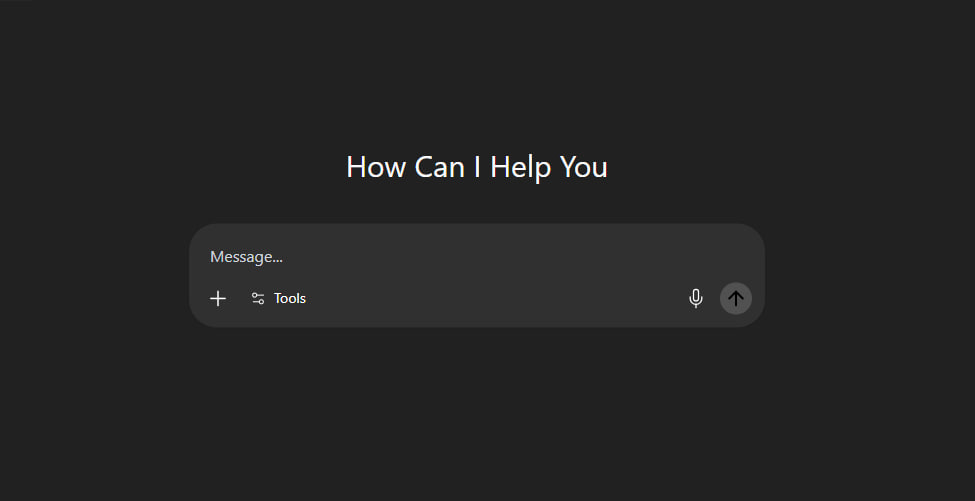
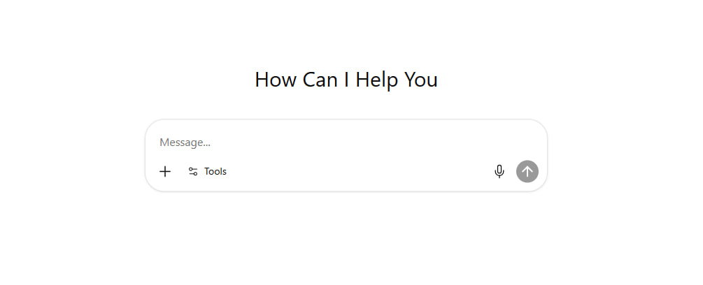
The ChatGPT input UI you wanted to copy but couldn't. Drop this prompt into Claude or Cursor and it generates a production-ready React component (shadcn + Tailwind 4) — auto-resizing textarea, tools popover, image preview, mic button, send action. Saves 4 hours of design work.
Built with
Claude OpusAnthropic
Prompt
Copy this prompt and feed it to your favorite AI to remix the project.
You are given a task to integrate an existing React component in the codebase

The codebase should support:
- shadcn project structure
- Tailwind CSS
- Typescript

If it doesn't, provide instructions on how to setup project via shadcn CLI, install Tailwind or Typescript.

Determine the default path for components and styles.
If default path for components is not /components/ui, provide instructions on why it's important to create this folder
Copy-paste this component to /components/ui folder:
```tsx
chatgpt-prompt-input.tsx
// component.tsx
import * as React from "react";
import * as TooltipPrimitive from "@radix-ui/react-tooltip";
import * as PopoverPrimitive from "@radix-ui/react-popover";
import * as DialogPrimitive from "@radix-ui/react-dialog";

// --- Utility Function & Radix Primitives (Unchanged) ---
type ClassValue = string | number | boolean | null | undefined;
function cn(...inputs: ClassValue[]): string { return inputs.filter(Boolean).join(" "); }
const TooltipProvider = TooltipPrimitive.Provider;
const Tooltip = TooltipPrimitive.Root;
const TooltipTrigger = TooltipPrimitive.Trigger;
const TooltipContent = React.forwardRef<React.ElementRef<typeof TooltipPrimitive.Content>, React.ComponentPropsWithoutRef<typeof TooltipPrimitive.Content> & { showArrow?: boolean }>(({ className, sideOffset = 4, showArrow = false, ...props }, ref) => ( <TooltipPrimitive.Portal><TooltipPrimitive.Content ref={ref} sideOffset={sideOffset} className={cn("relative z-50 max-w-[280px] rounded-md bg-popover text-popover-foreground px-1.5 py-1 text-xs animate-in fade-in-0 zoom-in-95 data-[state=closed]:animate-out data-[state=closed]:fade-out-0 data-[state=closed]:zoom-out-95 data-[side=bottom]:slide-in-from-top-2 data-[side=left]:slide-in-from-right-2 data-[side=right]:slide-in-from-left-2 data-[side=top]:slide-in-from-bottom-2", className)} {...props}>{props.children}{showArrow && <TooltipPrimitive.Arrow className="-my-px fill-popover" />}</TooltipPrimitive.Content></TooltipPrimitive.Portal>));
TooltipContent.displayName = TooltipPrimitive.Content.displayName;
const Popover = PopoverPrimitive.Root;
const PopoverTrigger = PopoverPrimitive.Trigger;
const PopoverContent = React.forwardRef<React.ElementRef<typeof PopoverPrimitive.Content>, React.ComponentPropsWithoutRef<typeof PopoverPrimitive.Content>>(({ className, align = "center", sideOffset = 4, ...props }, ref) => ( <PopoverPrimitive.Portal><PopoverPrimitive.Content ref={ref} align={align} sideOffset={sideOffset} className={cn("z-50 w-64 rounded-xl bg-popover dark:bg-[#303030] p-2 text-popover-foreground dark:text-white shadow-md outline-none animate-in data-[state=open]:fade-in-0 data-[state=closed]:fade-out-0 data-[state=open]:zoom-in-95 data-[state=closed]:zoom-out-95 data-[side=bottom]:slide-in-from-top-2 data-[side=left]:slide-in-from-right-2 data-[side=right]:slide-in-from-left-2 data-[side=top]:slide-in-from-bottom-2", className)} {...props} /></PopoverPrimitive.Portal>));
PopoverContent.displayName = PopoverPrimitive.Content.displayName;
const Dialog = DialogPrimitive.Root;
const DialogPortal = DialogPrimitive.Portal;
const DialogTrigger = DialogPrimitive.Trigger;
const DialogOverlay = React.forwardRef<React.ElementRef<typeof DialogPrimitive.Overlay>, React.ComponentPropsWithoutRef<typeof DialogPrimitive.Overlay>>(({ className, ...props }, ref) => ( <DialogPrimitive.Overlay ref={ref} className={cn("fixed inset-0 z-50 bg-black/60 backdrop-blur-sm data-[state=open]:animate-in data-[state=closed]:animate-out data-[state=closed]:fade-out-0 data-[state=open]:fade-in-0", className)} {...props} />));
DialogOverlay.displayName = DialogPrimitive.Overlay.displayName;
const DialogContent = React.forwardRef<React.ElementRef<typeof DialogPrimitive.Content>, React.ComponentPropsWithoutRef<typeof DialogPrimitive.Content>>(({ className, children, ...props }, ref) => ( <DialogPortal><DialogOverlay /><DialogPrimitive.Content ref={ref} className={cn("fixed left-[50%] top-[50%] z-50 grid w-full max-w-[90vw] md:max-w-[800px] translate-x-[-50%] translate-y-[-50%] gap-4 border-none bg-transparent p-0 shadow-none duration-300 data-[state=open]:animate-in data-[state=closed]:animate-out data-[state=closed]:fade-out-0 data-[state=open]:fade-in-0 data-[state=closed]:zoom-out-95 data-[state=open]:zoom-in-95", className)} {...props}><div className="relative bg-card dark:bg-[#303030] rounded-[28px] overflow-hidden shadow-2xl p-1">{children}<DialogPrimitive.Close className="absolute right-3 top-3 z-10 rounded-full bg-background/50 dark:bg-[#303030] p-1 hover:bg-accent dark:hover:bg-[#515151] transition-all"><XIcon className="h-5 w-5 text-muted-foreground dark:text-gray-200 hover:text-foreground dark:hover:text-white" /><span className="sr-only">Close</span></DialogPrimitive.Close></div></DialogPrimitive.Content></DialogPortal>));
DialogContent.displayName = DialogPrimitive.Content.displayName;

// --- SVG Icon Components ---
const PlusIcon = (props: React.SVGProps<SVGSVGElement>) => ( <svg width="24" height="24" viewBox="0 0 24 24" fill="none" xmlns="http://www.w3.org/2000/svg" {...props}> <path d="M12 5V19" stroke="currentColor" strokeWidth="1.5" strokeLinecap="round" strokeLinejoin="round"/> <path d="M5 12H19" stroke="currentColor" strokeWidth="1.5" strokeLinecap="round" strokeLinejoin="round"/> </svg> );
const Settings2Icon = (props: React.SVGProps<SVGSVGElement>) => ( <svg width="24" height="24" viewBox="0 0 24 24" fill="none" stroke="currentColor" strokeWidth="1.5" strokeLinecap="round" strokeLinejoin="round" {...props}> <path d="M20 7h-9" /> <path d="M14 17H5" /> <circle cx="17" cy="17" r="3" /> <circle cx="7" cy="7" r="3" /> </svg> );
const SendIcon = (props: React.SVGProps<SVGSVGElement>) => ( <svg width="24" height="24" viewBox="0 0 24 24" fill="none" xmlns="http://www.w3.org/2000/svg" {...props}> <path d="M12 5.25L12 18.75" stroke="currentColor" strokeWidth="2" strokeLinecap="round" strokeLinejoin="round" /> <path d="M18.75 12L12 5.25L5.25 12" stroke="currentColor" strokeWidth="2" strokeLinecap="round" strokeLinejoin="round" /> </svg> );
const XIcon = (props: React.SVGProps<SVGSVGElement>) => ( <svg width="24" height="24" viewBox="0 0 24 24" fill="none" stroke="currentColor" strokeWidth="2" strokeLinecap="round" strokeLinejoin="round" {...props}> <line x1="18" y1="6" x2="6" y2="18" /> <line x1="6" y1="6" x2="18" y2="18" /> </svg> );
const GlobeIcon = (props: React.SVGProps<SVGSVGElement>) => ( <svg width="24" height="24" viewBox="0 0 24 24" fill="none" stroke="currentColor" strokeWidth="1.5" strokeLinecap="round" strokeLinejoin="round" {...props}><circle cx="12" cy="12" r="10"/><path d="M2 12h20"/><path d="M12 2a15.3 15.3 0 0 1 4 10 15.3 15.3 0 0 1-4 10 15.3 15.3 0 0 1-4-10 15.3 15.3 0 0 1 4-10z"/></svg>);
const PencilIcon = (props: React.SVGProps<SVGSVGElement>) => ( <svg width="24" height="24" viewBox="0 0 24 24" fill="none" stroke="currentColor" strokeWidth="1.5" strokeLinecap="round" strokeLinejoin="round" {...props}><path d="M17 3a2.85 2.83 0 1 1 4 4L7.5 20.5 2 22l1.5-5.5Z"/><path d="m15 5 4 4"/></svg>);
const PaintBrushIcon = (props: React.SVGProps<SVGSVGElement>) => ( <svg viewBox="0 0 512 512" fill="currentColor" {...props}> <g> <path d="M141.176,324.641l25.323,17.833c7.788,5.492,17.501,7.537,26.85,5.67c9.35-1.877,17.518-7.514,22.597-15.569l22.985-36.556l-78.377-55.222l-26.681,33.96c-5.887,7.489-8.443,17.081-7.076,26.511C128.188,310.69,133.388,319.158,141.176,324.641z"/> <path d="M384.289,64.9c9.527-15.14,5.524-35.06-9.083-45.355l-0.194-0.129c-14.615-10.296-34.728-7.344-45.776,6.705L170.041,228.722l77.067,54.292L384.289,64.9z"/> <path d="M504.745,445.939c-4.011,0-7.254,3.251-7.254,7.262s3.243,7.246,7.254,7.246c4.012,0,7.255-3.235,7.255-7.246S508.757,445.939,504.745,445.939z"/> <path d="M457.425,432.594c3.914,0,7.092-3.179,7.092-7.101c0-3.898-3.178-7.077-7.092-7.077c-3.915,0-7.093,3.178-7.093,7.077C450.332,429.415,453.51,432.594,457.425,432.594z"/> <path d="M164.493,440.972c14.671-20.817,16.951-48.064,5.969-71.089l-0.462-0.97l-54.898-38.675l-1.059-0.105c-25.379-2.596-50.256,8.726-64.928,29.552c-13.91,19.742-18.965,41.288-23.858,62.113c-3.333,14.218-6.778,28.929-13.037,43.05c-5.168,11.695-8.63,15.868-8.654,15.884L0,484.759l4.852,2.346c22.613,10.902,53.152,12.406,83.779,4.156C120.812,482.584,147.76,464.717,164.493,440.972z M136.146,446.504c-0.849,0.567-1.714,1.19-2.629,1.892c-10.06,7.91-23.17,4.505-15.188-11.54c7.966-16.054-6.09-21.198-17.502-10.652c-14.323,13.232-21.044,2.669-18.391-4.634c2.636-7.304,12.155-17.267,4.189-23.704c-4.788-3.882-10.967,1.795-20.833,9.486c-5.645,4.392-18.666,2.968-13.393-16.563c2.863-7.271,6.389-14.275,11.104-20.971c10.24-14.542,27.603-23.083,45.404-22.403l47.021,33.11c6.632,16.548,4.416,35.764-5.823,50.305C146.167,436.411,141.476,441.676,136.146,446.504z"/> <path d="M471.764,441.992H339.549c-0.227-0.477-0.38-1.003-0.38-1.57c0-0.913,0.372-1.73,0.93-2.378h81.531c5.848,0,10.578-4.723,10.578-10.578c0-5.84-4.73-10.571-10.578-10.571H197.765c0.308,15.399-4.116,30.79-13.271,43.786c-11.218,15.925-27.214,28.913-46.196,38.036h303.802c6.551,0,11.864-5.314,11.864-11.872c0-6.559-5.314-11.873-11.864-11.873h-55.392c-3.299,0-5.977-2.668-5.977-5.968c0-1.246,0.47-2.313,1.1-3.267h89.934c6.559,0,11.881-5.305,11.881-11.873C483.645,447.306,478.323,441.992,471.764,441.992z"/> </g> </svg> );
const TelescopeIcon = (props: React.SVGProps<SVGSVGElement>) => ( <svg viewBox="0 0 512 512" fill="currentColor" {...props}> <g> <path d="M452.425,202.575l-38.269-23.11c-1.266-10.321-5.924-18.596-13.711-21.947l-86.843-52.444l-0.275,0.598c-3.571-7.653-9.014-13.553-16.212-16.668L166.929,10.412l-0.236,0.543v-0.016c-3.453-2.856-7.347-5.239-11.594-7.08C82.569-10.435,40.76,14.5,21.516,59.203C2.275,103.827,12.82,151.417,45.142,165.36c4.256,1.826,8.669,3.005,13.106,3.556l-0.19,0.464l146.548,40.669c7.19,3.107,15.206,3.004,23.229,0.37l-0.236,0.566L365.55,238.5c7.819,3.366,17.094,1.125,25.502-5.082l42.957,11.909c7.67,3.312,18.014-3.548,23.104-15.362C462.202,218.158,460.11,205.894,452.425,202.575z M154.516,99.56c-11.792,27.374-31.402,43.783-47.19,49.132c-6.962,2.281-13.176,2.556-17.605,0.637c-14.536-6.254-25.235-41.856-8.252-81.243c16.976-39.378,50.186-56.055,64.723-49.785c4.429,1.904,8.519,6.592,11.626,13.246C164.774,46.699,166.3,72.216,154.516,99.56z"/> <path d="M297.068,325.878c-1.959-2.706-2.25-6.269-0.724-9.25c1.518-2.981,4.562-4.846,7.913-4.846h4.468c4.909,0,8.889-3.972,8.889-8.897v-7.74c0-4.909-3.98-8.897-8.889-8.897h-85.789c-4.908,0-8.897,3.988-8.897,8.897v7.74c0,4.925,3.989,8.897,8.897,8.897h4.492c3.344,0,6.388,1.865,7.914,4.846c1.518,2.981,1.235,6.544-0.732,9.25L128.715,459.116c-3.225,4.287-2.352,10.36,1.927,13.569c4.295,3.225,10.368,2.344,13.578-1.943l107.884-122.17l4.036,153.738c0,5.333,4.342,9.691,9.691,9.691c5.358,0,9.692-4.358,9.692-9.691l4.043-153.738l107.885,122.17c3.209,4.287,9.282,5.168,13.568,1.943c4.288-3.209,5.145-9.282,1.951-13.569L297.068,325.878z"/> <path d="M287.227,250.81c0-11.807-9.573-21.388-21.396-21.388c-11.807,0-21.38,9.582-21.38,21.388c0,11.831,9.574,21.428,21.38,21.428C277.654,272.238,287.227,262.642,287.227,250.81z"/> </g> </svg> );
const LightbulbIcon = (props: React.SVGProps<SVGSVGElement>) => ( <svg viewBox="0 0 24 24" fill="none" {...props}> <path d="M12 7C9.23858 7 7 9.23858 7 12C7 13.3613 7.54402 14.5955 8.42651 15.4972C8.77025 15.8484 9.05281 16.2663 9.14923 16.7482L9.67833 19.3924C9.86537 20.3272 10.6862 21 11.6395 21H12.3605C13.3138 21 14.1346 20.3272 14.3217 19.3924L14.8508 16.7482C14.9472 16.2663 15.2297 15.8484 15.5735 15.4972C16.456 14.5955 17 13.3613 17 12C17 9.23858 14.7614 7 12 7Z" stroke="currentColor" strokeWidth="2"/> <path d="M12 4V3" stroke="currentColor" strokeWidth="2" strokeLinecap="round" strokeLinejoin="round"/> <path d="M18 6L19 5" stroke="currentColor" strokeWidth="2" strokeLinecap="round" strokeLinejoin="round"/> <path d="M20 12H21" stroke="currentColor" strokeWidth="2" strokeLinecap="round" strokeLinejoin="round"/> <path d="M4 12H3" stroke="currentColor" strokeWidth="2" strokeLinecap="round" strokeLinejoin="round"/> <path d="M5 5L6 6" stroke="currentColor" strokeWidth="2" strokeLinecap="round" strokeLinejoin="round"/> <path d="M10 17H14" stroke="currentColor" strokeWidth="2" strokeLinecap="round" strokeLinejoin="round"/> </svg> );
// NEW: MicIcon
const MicIcon = (props: React.SVGProps<SVGSVGElement>) => ( <svg width="24" height="24" viewBox="0 0 24 24" fill="none" stroke="currentColor" strokeWidth="1.5" strokeLinecap="round" strokeLinejoin="round" {...props}> <path d="M12 1a3 3 0 0 0-3 3v8a3 3 0 0 0 6 0V4a3 3 0 0 0-3-3z"></path> <path d="M19 10v2a7 7 0 0 1-14 0v-2"></path> <line x1="12" y1="19" x2="12" y2="23"></line> </svg> );


const toolsList = [ { id: 'createImage', name: 'Create an image', shortName: 'Image', icon: PaintBrushIcon }, { id: 'searchWeb', name: 'Search the web', shortName: 'Search', icon: GlobeIcon }, { id: 'writeCode', name: 'Write or code', shortName: 'Write', icon: PencilIcon }, { id: 'deepResearch', name: 'Run deep research', shortName: 'Deep Search', icon: TelescopeIcon, extra: '5 left' }, { id: 'thinkLonger', name: 'Think for longer', shortName: 'Think', icon: LightbulbIcon }, ];

// --- The Final, Self-Contained PromptBox Component ---
export const PromptBox = React.forwardRef<HTMLTextAreaElement, React.TextareaHTMLAttributes<HTMLTextAreaElement>>(
  ({ className, ...props }, ref) => {
    // ... all state and handlers are unchanged ...
    const internalTextareaRef = React.useRef<HTMLTextAreaElement>(null);
    const fileInputRef = React.useRef<HTMLInputElement>(null);
    const [value, setValue] = React.useState("");
    const [imagePreview, setImagePreview] = React.useState<string | null>(null);
    const [selectedTool, setSelectedTool] = React.useState<string | null>(null);
    const [isPopoverOpen, setIsPopoverOpen] = React.useState(false);
    const [isImageDialogOpen, setIsImageDialogOpen] = React.useState(false);
    React.useImperativeHandle(ref, () => internalTextareaRef.current!, []);
    React.useLayoutEffect(() => { const textarea = internalTextareaRef.current; if (textarea) { textarea.style.height = "auto"; const newHeight = Math.min(textarea.scrollHeight, 200); textarea.style.height = `${newHeight}px`; } }, [value]);
    const handleInputChange = (e: React.ChangeEvent<HTMLTextAreaElement>) => { setValue(e.target.value); if (props.onChange) props.onChange(e); };
    const handlePlusClick = () => { fileInputRef.current?.click(); };
    const handleFileChange = (event: React.ChangeEvent<HTMLInputElement>) => { const file = event.target.files?.[0]; if (file && file.type.startsWith("image/")) { const reader = new FileReader(); reader.onloadend = () => { setImagePreview(reader.result as string); }; reader.readAsDataURL(file); } event.target.value = ""; };
    const handleRemoveImage = (e: React.MouseEvent<HTMLButtonElement>) => { e.stopPropagation(); setImagePreview(null); if(fileInputRef.current) { fileInputRef.current.value = ""; } };
    const hasValue = value.trim().length > 0 || imagePreview;
    const activeTool = selectedTool ? toolsList.find(t => t.id === selectedTool) : null;
    const ActiveToolIcon = activeTool?.icon;

    return (
      <div className={cn("flex flex-col rounded-[28px] p-2 shadow-sm transition-colors bg-white border dark:bg-[#303030] dark:border-transparent cursor-text", className)}>
        <input type="file" ref={fileInputRef} onChange={handleFileChange} className="hidden" accept="image/*"/>

        {imagePreview && ( <Dialog open={isImageDialogOpen} onOpenChange={setIsImageDialogOpen}> <div className="relative mb-1 w-fit rounded-[1rem] px-1 pt-1"> <button type="button" className="transition-transform" onClick={() => setIsImageDialogOpen(true)}> <img src={imagePreview} alt="Image preview" className="h-14.5 w-14.5 rounded-[1rem]" /> </button> <button onClick={handleRemoveImage} className="absolute right-2 top-2 z-10 flex h-4 w-4 items-center justify-center rounded-full bg-white/50 dark:bg-[#303030] text-black dark:text-white transition-colors hover:bg-accent dark:hover:bg-[#515151]" aria-label="Remove image"> <XIcon className="h-4 w-4" /> </button> </div> <DialogContent> <img src={imagePreview} alt="Full size preview" className="w-full max-h-[95vh] object-contain rounded-[24px]" /> </DialogContent> </Dialog> )}

        <textarea ref={internalTextareaRef} rows={1} value={value} onChange={handleInputChange} placeholder="Message..." className="custom-scrollbar w-full resize-none border-0 bg-transparent p-3 text-foreground dark:text-white placeholder:text-muted-foreground dark:placeholder:text-gray-300 focus:ring-0 focus-visible:outline-none min-h-12" {...props} />

        <div className="mt-0.5 p-1 pt-0">
          <TooltipProvider delayDuration={100}>
            <div className="flex items-center gap-2">
              <Tooltip> <TooltipTrigger asChild><button type="button" onClick={handlePlusClick} className="flex h-8 w-8 items-center justify-center rounded-full text-foreground dark:text-white transition-colors hover:bg-accent dark:hover:bg-[#515151] focus-visible:outline-none"><PlusIcon className="h-6 w-6" /><span className="sr-only">Attach image</span></button></TooltipTrigger> <TooltipContent side="top" showArrow={true}><p>Attach image</p></TooltipContent> </Tooltip>

              <Popover open={isPopoverOpen} onOpenChange={setIsPopoverOpen}>
                <Tooltip>
                  <TooltipTrigger asChild>
                    <PopoverTrigger asChild>
                      <button type="button" className="flex h-8 items-center gap-2 rounded-full p-2 text-sm text-foreground dark:text-white transition-colors hover:bg-accent dark:hover:bg-[#515151] focus-visible:outline-none focus-visible:ring-ring">
                        <Settings2Icon className="h-4 w-4" />
                        {!selectedTool && 'Tools'}
                      </button>
                    </PopoverTrigger>
                  </TooltipTrigger>
                  <TooltipContent side="top" showArrow={true}><p>Explore Tools</p></TooltipContent>
                </Tooltip>
                <PopoverContent side="top" align="start">
                  <div className="flex flex-col gap-1">
                    {toolsList.map(tool => ( <button key={tool.id} onClick={() => { setSelectedTool(tool.id); setIsPopoverOpen(false); }} className="flex w-full items-center gap-2 rounded-md p-2 text-left text-sm hover:bg-accent dark:hover:bg-[#515151]"> <tool.icon className="h-4 w-4" /> <span>{tool.name}</span> {tool.extra && <span className="ml-auto text-xs text-muted-foreground dark:text-gray-400">{tool.extra}</span>} </button> ))}
                  </div>
                </PopoverContent>
              </Popover>

              {activeTool && (
                <>
                  <div className="h-4 w-px bg-border dark:bg-gray-600" />
                  <button onClick={() => setSelectedTool(null)} className="flex h-8 items-center gap-2 rounded-full px-2 text-sm dark:hover:bg-[#3b4045] hover:bg-accent cursor-pointer dark:text-[#99ceff] text-[#2294ff] transition-colors flex-row items-center justify-center">
                    {ActiveToolIcon && <ActiveToolIcon className="h-4 w-4" />}
                    {activeTool.shortName}
                    <XIcon className="h-4 w-4" />
                  </button>
                </>
              )}

              {/* MODIFIED: Right-aligned buttons container */}
              <div className="ml-auto flex items-center gap-2">
                <Tooltip>
                  <TooltipTrigger asChild>
                    <button type="button" className="flex h-8 w-8 items-center justify-center rounded-full text-foreground dark:text-white transition-colors hover:bg-accent dark:hover:bg-[#515151] focus-visible:outline-none">
                      <MicIcon className="h-5 w-5" />
                      <span className="sr-only">Record voice</span>
                    </button>
                  </TooltipTrigger>
                  <TooltipContent side="top" showArrow={true}><p>Record voice</p></TooltipContent>
                </Tooltip>

                <Tooltip>
                  <TooltipTrigger asChild>
                    <button type="submit" disabled={!hasValue} className="flex h-8 w-8 items-center justify-center rounded-full text-sm font-medium transition-colors focus-visible:outline-none focus-visible:ring-2 focus-visible:ring-ring disabled:pointer-events-none bg-black text-white hover:bg-black/80 dark:bg-white dark:text-black dark:hover:bg-white/80 disabled:bg-black/40 dark:disabled:bg-[#515151]">
                      <SendIcon className="h-6 w-6 text-bold" />
                      <span className="sr-only">Send message</span>
                    </button>
                  </TooltipTrigger>
                  <TooltipContent side="top" showArrow={true}><p>Send</p></TooltipContent>
                </Tooltip>
              </div>
            </div>
          </TooltipProvider>
        </div>
      </div>
    );
  }
);
PromptBox.displayName = "PromptBox";

demo.tsx
import { PromptBox } from "@/components/ui/chatgpt-prompt-input";

export function PromptBoxDemo() {
  const handleSubmit = (event: React.FormEvent<HTMLFormElement>) => {
    event.preventDefault();
    const formData = new FormData(event.currentTarget);
    const message = formData.get("message");
    // In a real app, you would also handle the uploaded file here.
    if (!message && !event.currentTarget.querySelector('img')) {
      return;
    }
    alert(`Message Submitted!`);
  };

  return (
    <div className="flex min-h-screen w-full flex-col items-center justify-center bg-background dark:bg-[#212121] p-4">
      <div className="w-full max-w-xl flex flex-col gap-10">
          <p className="text-center text-3xl text-foreground">
            How Can I Help You
          </p>
          <PromptBox />
      </div>
    </div>
  );
}
```

Install NPM dependencies:
```bash
@radix-ui/react-dialog, @radix-ui/react-popover, @radix-ui/react-tooltip
```

Extend existing Tailwind 4 index.css with this code (or if project uses Tailwind 3, extend tailwind.config.js or globals.css):
```css
@import "tailwindcss";
@import "tw-animate-css";

:root {
  --radius: 0.65rem;
}

```

Implementation Guidelines
 1. Analyze the component structure and identify all required dependencies
 2. Review the component's argumens and state
 3. Identify any required context providers or hooks and install them
 4. Questions to Ask
 - What data/props will be passed to this component?
 - Are there any specific state management requirements?
 - Are there any required assets (images, icons, etc.)?
 - What is the expected responsive behavior?
 - What is the best place to use this component in the app?

Steps to integrate
 0. Copy paste all the code above in the correct directories
 1. Install external dependencies
 2. Fill image assets with Unsplash stock images you know exist
 3. Use lucide-react icons for svgs or logos if component requires them
Tech Stack
ReactTypeScriptTailwind v4shadcn/uiRadix UI
Views
49
Downloads
6
Forks
0
Status
Live
0 Comments