1 / 2
Back
Prompt🎯 1 prompt
Voice chat design
About
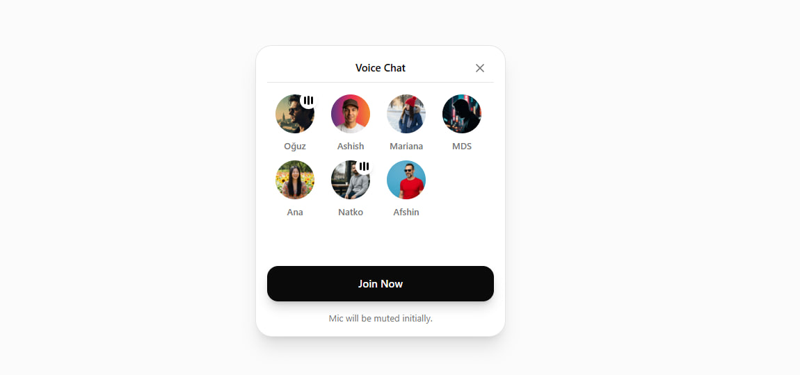
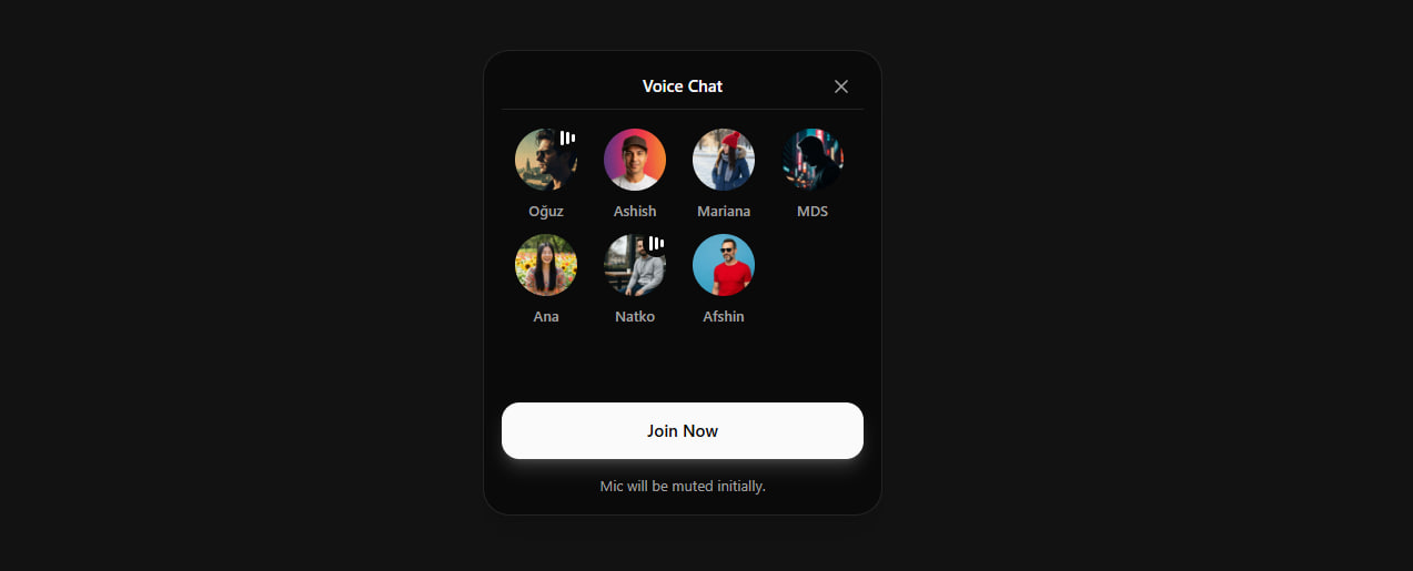
The smooth iOS-style voice chat UI you've seen in Twitter Spaces and Clubhouse — pill that expands into a participant grid with speaking indicators and Join Now button. Drop this prompt into Claude or Cursor and you get the whole React + shadcn + Tailwind component in one shot. cubic-bezier animations included.
Built with
Claude OpusAnthropic
Prompt
Copy this prompt and feed it to your favorite AI to remix the project.
You are given a task to integrate an existing React component in the codebase

The codebase should support:
- shadcn project structure
- Tailwind CSS
- Typescript

If it doesn't, provide instructions on how to setup project via shadcn CLI, install Tailwind or Typescript.

Determine the default path for components and styles.
If default path for components is not /components/ui, provide instructions on why it's important to create this folder
Copy-paste this component to /components/ui folder:
```tsx
audio-chat.tsx
"use client"

import { useState } from "react"
import { ChevronDown, X } from "lucide-react"
import { cn } from "@/lib/utils"

interface Participant {
  id: string
  name: string
  avatar: string
  isSpeaking?: boolean
}

const participants: Participant[] = [
  { id: "1", name: "Oğuz", avatar: "https://hebbkx1anhila5yf.public.blob.vercel-storage.com/attachments/gen-images/public/man-with-sunglasses-profile-artistic-3Q0PBah5WBqwZeeWGCWABFOpCyhcmD.jpg", isSpeaking: true },
  { id: "2", name: "Ashish", avatar: "https://hebbkx1anhila5yf.public.blob.vercel-storage.com/attachments/gen-images/public/man-with-cap-colorful-gradient-background-k6UaFzKucKJ2tzaK32l1XFTkv5dPAS.jpg" },
  { id: "3", name: "Mariana", avatar: "https://hebbkx1anhila5yf.public.blob.vercel-storage.com/attachments/gen-images/public/person-with-winter-hat-scarf-cold-5KFfWSpCqM4Ksf7yXgiVhxSweVw5tH.jpg" },
  { id: "4", name: "MDS", avatar: "https://hebbkx1anhila5yf.public.blob.vercel-storage.com/attachments/gen-images/public/silhouette-dark-artistic-portrait-HUaRj3gVUuhrGF2L8HaOGlawK4EAfZ.jpg" },
  { id: "5", name: "Ana", avatar: "https://hebbkx1anhila5yf.public.blob.vercel-storage.com/attachments/gen-images/public/woman-smiling-outdoor-background-M1BHNIp7XAzAPWwbIbY47V6WEFk703.jpg" },
  { id: "6", name: "Natko", avatar: "https://hebbkx1anhila5yf.public.blob.vercel-storage.com/attachments/gen-images/public/man-with-beard-hoodie-casual-tx32EFYsG69NBSuftk3cN16mOegxOe.jpg", isSpeaking: true },
  { id: "7", name: "Afshin", avatar: "https://hebbkx1anhila5yf.public.blob.vercel-storage.com/attachments/gen-images/public/man-with-sunglasses-red-shirt-blue-background-KvK2BMFg07EE8rLsTSQ8891UfCcSIV.jpg" },
]

const COLLAPSED_WIDTH = 268
const EXPANDED_WIDTH = 360 // slightly narrower for 3-column grid
const EXPANDED_HEIGHT = 420

const AVATAR_SIZE_COLLAPSED = 44
const AVATAR_SIZE_EXPANDED = 56
const AVATAR_OVERLAP = -12

function SpeakingIndicator({ show }: { show: boolean }) {
  return (
    <div
      className={cn(
        "absolute -top-1 -right-1 bg-background rounded-full p-1.5 shadow-md",
        "transition-all duration-500 ease-[cubic-bezier(0.32,0.72,0,1)]",
        show ? "opacity-100 scale-100" : "opacity-0 scale-0",
      )}
    >
      <div className="flex items-center justify-center gap-[2px]">
        <span className="w-[3px] bg-foreground rounded-full animate-wave-1" />
        <span className="w-[3px] bg-foreground rounded-full animate-wave-2" />
        <span className="w-[3px] bg-foreground rounded-full animate-wave-3" />
      </div>
    </div>
  )
}

function AudioWaveIcon({ isExpanded }: { isExpanded: boolean }) {
  return (
    <div
      className={cn(
        "absolute w-10 h-10 rounded-full bg-foreground flex items-center justify-center",
        "transition-all duration-500 ease-[cubic-bezier(0.32,0.72,0,1)]",
        isExpanded ? "opacity-0 scale-75" : "opacity-100 scale-100",
      )}
      style={{
        left: 12,
        top: "50%",
        transform: `translateY(-50%) ${isExpanded ? "scale(0.75)" : "scale(1)"}`,
      }}
    >
      <div className="flex items-center justify-center gap-[2px]">
        <span className="w-[3px] bg-background rounded-full animate-wave-1" />
        <span className="w-[3px] bg-background rounded-full animate-wave-2" />
        <span className="w-[3px] bg-background rounded-full animate-wave-3" />
      </div>
    </div>
  )
}

function getAvatarPosition(index: number, isExpanded: boolean) {
  if (!isExpanded) {
    const startX = 60 // after audio wave icon
    return {
      x: startX + index * (AVATAR_SIZE_COLLAPSED + AVATAR_OVERLAP),
      y: 8, // centered vertically in collapsed pill
      size: AVATAR_SIZE_COLLAPSED,
      opacity: index < 4 ? 1 : 0,
      scale: 1,
    }
  } else {
    const gridStartX = 28
    const gridStartY = 70
    const colWidth = 80
    const rowHeight = 95

    let col: number
    let row: number

    if (index < 4) {
      col = index
      row = 0
    } else {
      col = index - 4
      row = 1
    }

    return {
      x: gridStartX + col * colWidth,
      y: gridStartY + row * rowHeight,
      size: AVATAR_SIZE_EXPANDED,
      opacity: 1,
      scale: 1,
    }
  }
}

export function VoiceChat() {
  const [isExpanded, setIsExpanded] = useState(false)

  return (
    <>
      <style jsx global>{`
        @keyframes wave {
          0%, 100% { height: 6px; }
          50% { height: 14px; }
        }
        .animate-wave-1 { animation: wave 0.5s ease-in-out infinite; }
        .animate-wave-2 { animation: wave 0.5s ease-in-out infinite 0.1s; }
        .animate-wave-3 { animation: wave 0.5s ease-in-out infinite 0.2s; }
      `}</style>

      <div
        onClick={() => !isExpanded && setIsExpanded(true)}
        className={cn(
          "relative bg-background shadow-xl shadow-black/10 border border-border overflow-hidden",
          "transition-all duration-500 ease-[cubic-bezier(0.32,0.72,0,1)]",
          !isExpanded && "cursor-pointer hover:shadow-2xl hover:shadow-black/15",
        )}
        style={{
          width: isExpanded ? EXPANDED_WIDTH : COLLAPSED_WIDTH,
          height: isExpanded ? EXPANDED_HEIGHT : 60,
          borderRadius: isExpanded ? 24 : 999,
        }}
      >
        {/* Audio Wave Icon */}
        <AudioWaveIcon isExpanded={isExpanded} />

        {/* +3 Counter (collapsed only) */}
        <div
          className={cn(
            "absolute flex items-center gap-0.5 text-muted-foreground",
            "transition-all duration-500 ease-[cubic-bezier(0.32,0.72,0,1)]",
            isExpanded ? "opacity-0 pointer-events-none" : "opacity-100",
          )}
          style={{
            right: 16,
            top: "50%",
            transform: "translateY(-50%)",
          }}
        >
          <span className="text-md font-medium">+3</span>
          <ChevronDown className="w-4 h-4" />
        </div>

        {/* Header (expanded only) */}
        <div
          className={cn(
            "absolute inset-x-0 top-0 flex items-center justify-between px-5 pt-4 pb-3",
            "transition-all duration-500 ease-[cubic-bezier(0.32,0.72,0,1)]",
            isExpanded ? "opacity-100" : "opacity-0 pointer-events-none",
          )}
          style={{
            transitionDelay: isExpanded ? "100ms" : "0ms",
          }}
        >
          <div className="w-8" />
          <h2 className="text-[15px] font-semibold text-foreground">Voice Chat</h2>
          <button
            onClick={(e) => {
              e.stopPropagation()
              setIsExpanded(false)
            }}
            className="w-8 h-8 flex items-center justify-center rounded-full hover:bg-muted transition-colors"
          >
            <X className="w-5 h-5 text-muted-foreground" />
          </button>
        </div>

        {/* Divider */}
        <div
          className={cn(
            "absolute left-4 right-4 h-px bg-border",
            "transition-all duration-500 ease-[cubic-bezier(0.32,0.72,0,1)]",
            isExpanded ? "opacity-100" : "opacity-0",
          )}
          style={{ top: 52 }}
        />

        {participants.map((participant, index) => {
          const pos = getAvatarPosition(index, isExpanded)
          const delay = isExpanded ? index * 30 : (6 - index) * 20

          return (
            <div
              key={participant.id}
              className="absolute transition-all duration-500 ease-[cubic-bezier(0.32,0.72,0,1)]"
              style={{
                left: pos.x,
                top: pos.y,
                width: pos.size,
                height: isExpanded ? pos.size + 28 : pos.size,
                opacity: pos.opacity,
                zIndex: isExpanded ? 1 : 4 - index,
                transitionDelay: `${delay}ms`,
              }}
            >
              <div className="relative flex flex-col items-center">
                <div
                  className="rounded-full overflow-hidden ring-[2.5px] ring-background shadow-sm transition-all duration-500 ease-[cubic-bezier(0.32,0.72,0,1)]"
                  style={{
                    width: pos.size,
                    height: pos.size,
                  }}
                >
                  <img
                    src={participant.avatar || "/placeholder.svg"}
                    alt={participant.name}
                    className="w-full h-full object-cover"
                  />
                </div>
                <SpeakingIndicator show={isExpanded && !!participant.isSpeaking} />

                {/* Name - only visible when expanded */}
                <span
                  className={cn(
                    "absolute text-[13px] font-medium text-muted-foreground whitespace-nowrap",
                    "transition-all duration-500 ease-[cubic-bezier(0.32,0.72,0,1)]",
                    isExpanded ? "opacity-100" : "opacity-0",
                  )}
                  style={{
                    top: pos.size + 8,
                    transitionDelay: isExpanded ? `${150 + index * 30}ms` : "0ms",
                  }}
                >
                  {participant.name}
                </span>
              </div>
            </div>
          )
        })}

        {/* Join Button */}
        <button
          className={cn(
            "absolute left-4 right-4 bg-foreground text-background py-3.5 rounded-2xl font-medium text-[15px]",
            "shadow-lg shadow-foreground/20 hover:opacity-90 active:scale-[0.98]",
            "transition-all duration-500 ease-[cubic-bezier(0.32,0.72,0,1)]",
            isExpanded ? "opacity-100 translate-y-0" : "opacity-0 translate-y-4 pointer-events-none",
          )}
          style={{
            bottom: 50,
            transitionDelay: isExpanded ? "200ms" : "0ms",
          }}
        >
          Join Now
        </button>

        {/* Helper Text */}
        <p
          className={cn(
            "absolute inset-x-0 text-center text-[13px] text-muted-foreground",
            "transition-all duration-500 ease-[cubic-bezier(0.32,0.72,0,1)]",
            isExpanded ? "opacity-100" : "opacity-0",
          )}
          style={{
            bottom: 16,
            transitionDelay: isExpanded ? "250ms" : "0ms",
          }}
        >
          Mic will be muted initially.
        </p>
      </div>
    </>
  )
}


demo.tsx
import { VoiceChat } from "@/components/ui/audio-chat"

export default function Page() {
  return (
    <main className="min-h-screen bg-muted/30 flex items-center justify-center p-8 w-full">
      <VoiceChat />
    </main>
  )
}

```

Install NPM dependencies:
```bash
lucide-react
```

Implementation Guidelines
 1. Analyze the component structure and identify all required dependencies
 2. Review the component's argumens and state
 3. Identify any required context providers or hooks and install them
 4. Questions to Ask
 - What data/props will be passed to this component?
 - Are there any specific state management requirements?
 - Are there any required assets (images, icons, etc.)?
 - What is the expected responsive behavior?
 - What is the best place to use this component in the app?

Steps to integrate
 0. Copy paste all the code above in the correct directories
 1. Install external dependencies
 2. Fill image assets with Unsplash stock images you know exist
 3. Use lucide-react icons for svgs or logos if component requires them
Tech Stack
ReactTypeScriptTailwind CSSshadcn/uilucide-react
Views
34
Downloads
0
Forks
0
Status
Live
0 Comments